The brand identity and packaging design for this project are featured on DIELINE!
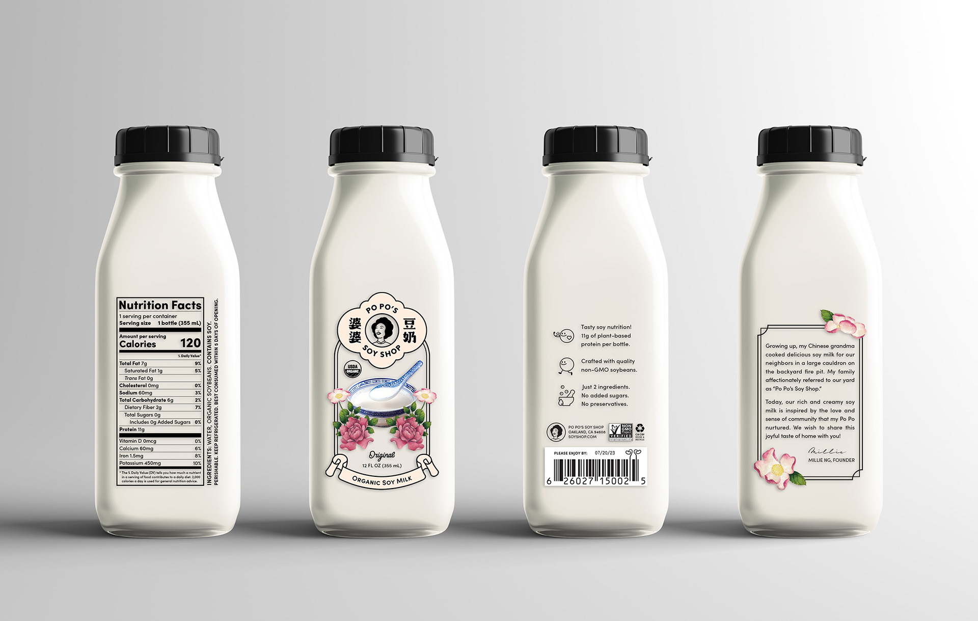
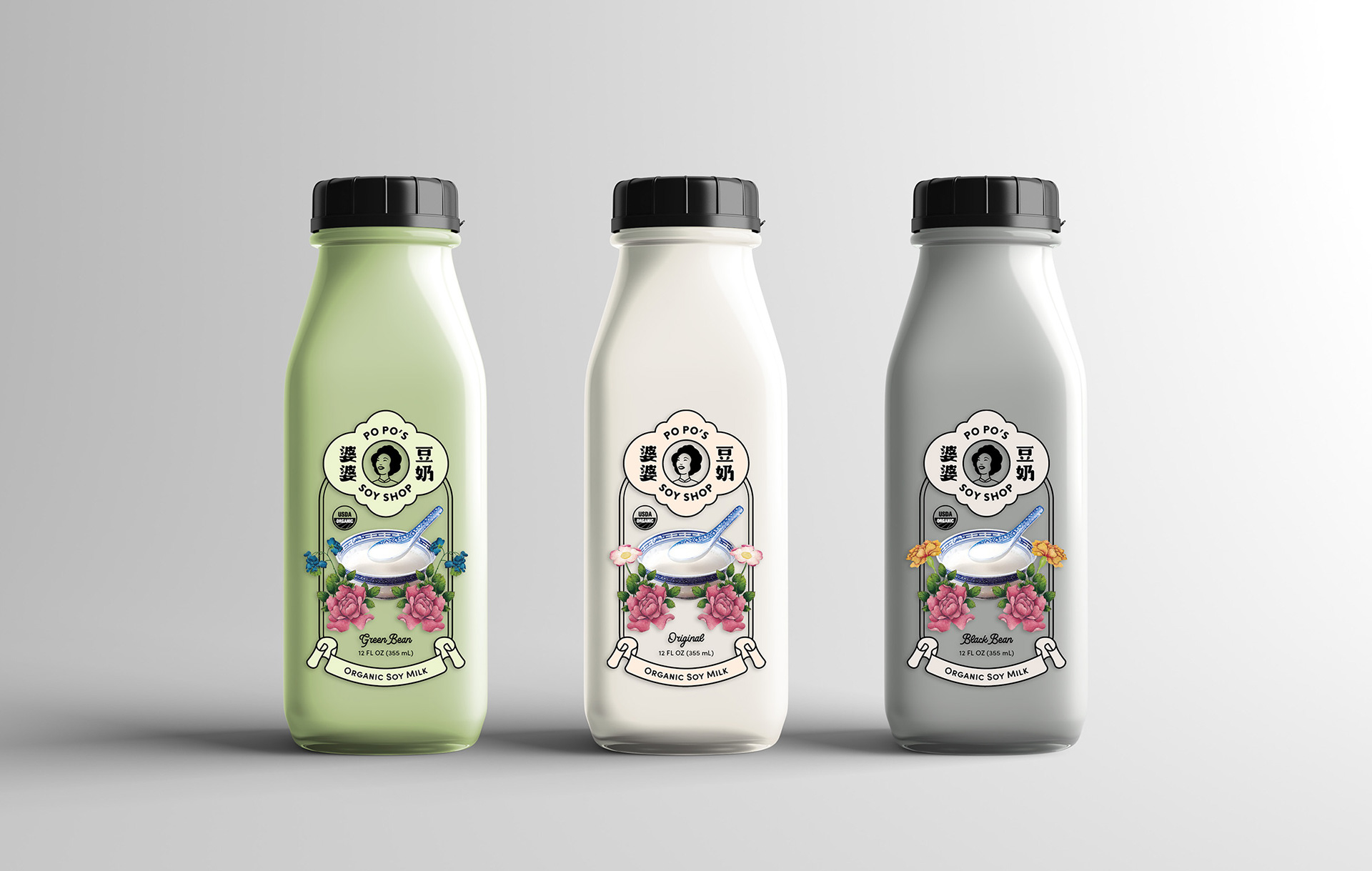
Po Po’s Soy Shop is a concept soy milk brand sold in Asian American coffee shops and dessert cafes. The product line features three flavors made from different types of soybeans, packaged in single-serving, grab-and-go glass bottles.
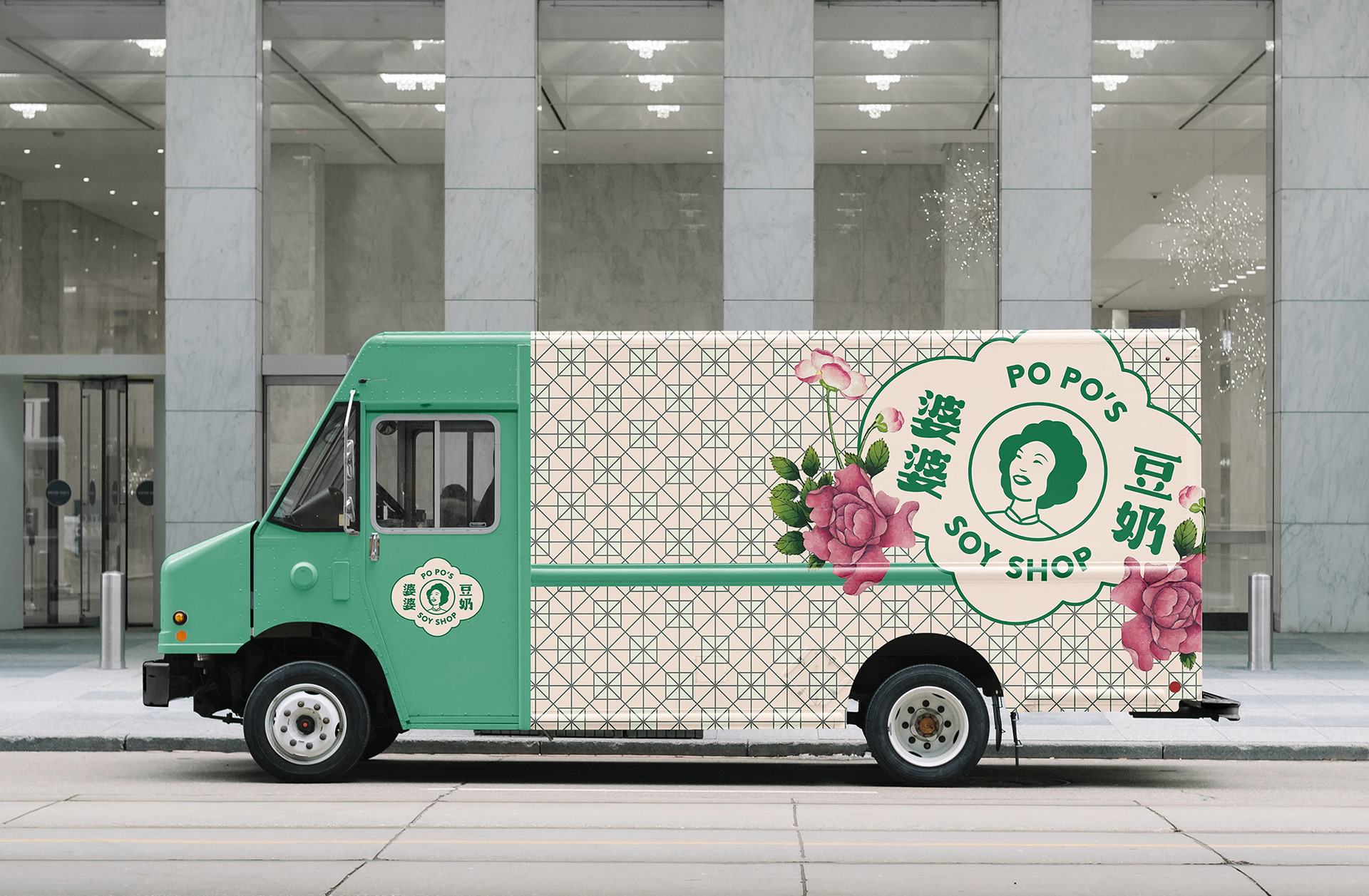
Tapping into the deep nostalgia associated with soy milk in Asian households, Po Po (Cantonese for grandma) is the inspiration behind the brand story: “Growing up, my Chinese grandma cooked delicious soy milk for our neighbors in a large cauldron on the backyard fire pit. My family affectionately referred to our yard as ‘Po Po’s Soy Shop.’ Today, our rich and creamy soy milk is inspired by the love and sense of community that my Po Po nurtured. We wish to share this joyful taste of home with you!”
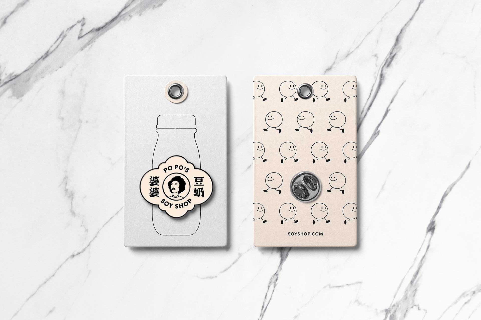
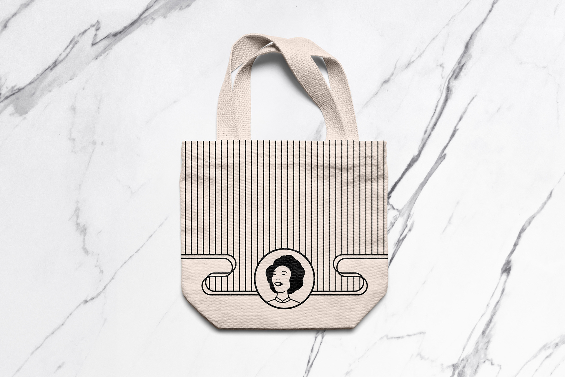
The logo centers around an illustration of Po Po in her youth, surrounded by the brand name in both Chinese calligraphy and English. Peonies, considered an auspicious symbol in Chinese culture, are pulled from Qing Dynasty artist Zhang Ruo’ai’s paintings and incorporated into the label design. The overall design takes inspiration from classic Asian packaging, as well as the shapes and typography of old Hong Kong neon signs, and reinterprets them with a modern flair.
Project
Po Po’s Soy Shop
Po Po’s Soy Shop
Type
Packaging
Branding
Logo Design
Collateral Design
Packaging
Branding
Logo Design
Collateral Design